Foundations needed a modern, scalable identity system that could grow with the company and the founders they support. Their existing visuals blended into a crowded consulting space and did not reflect the clarity, conviction, and momentum of their work. The brand had to become a signal for ambitious founders: this is a team that understands how they think and the future they are building.
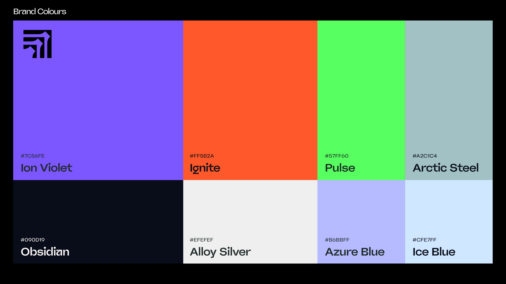
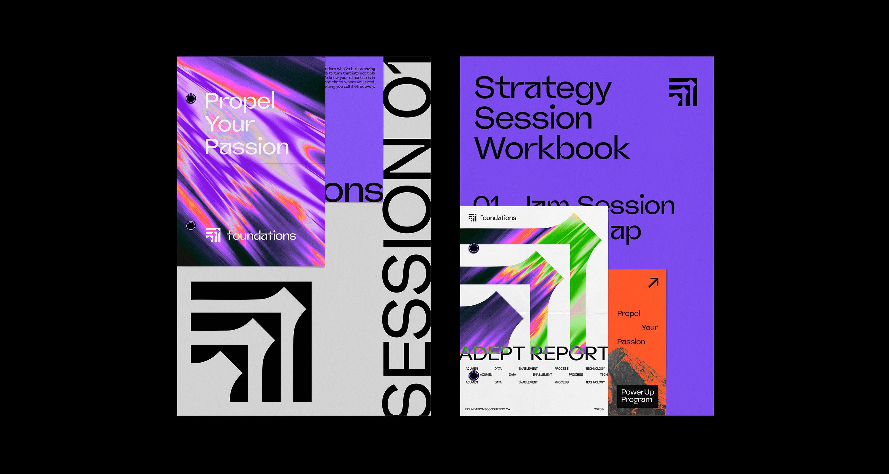
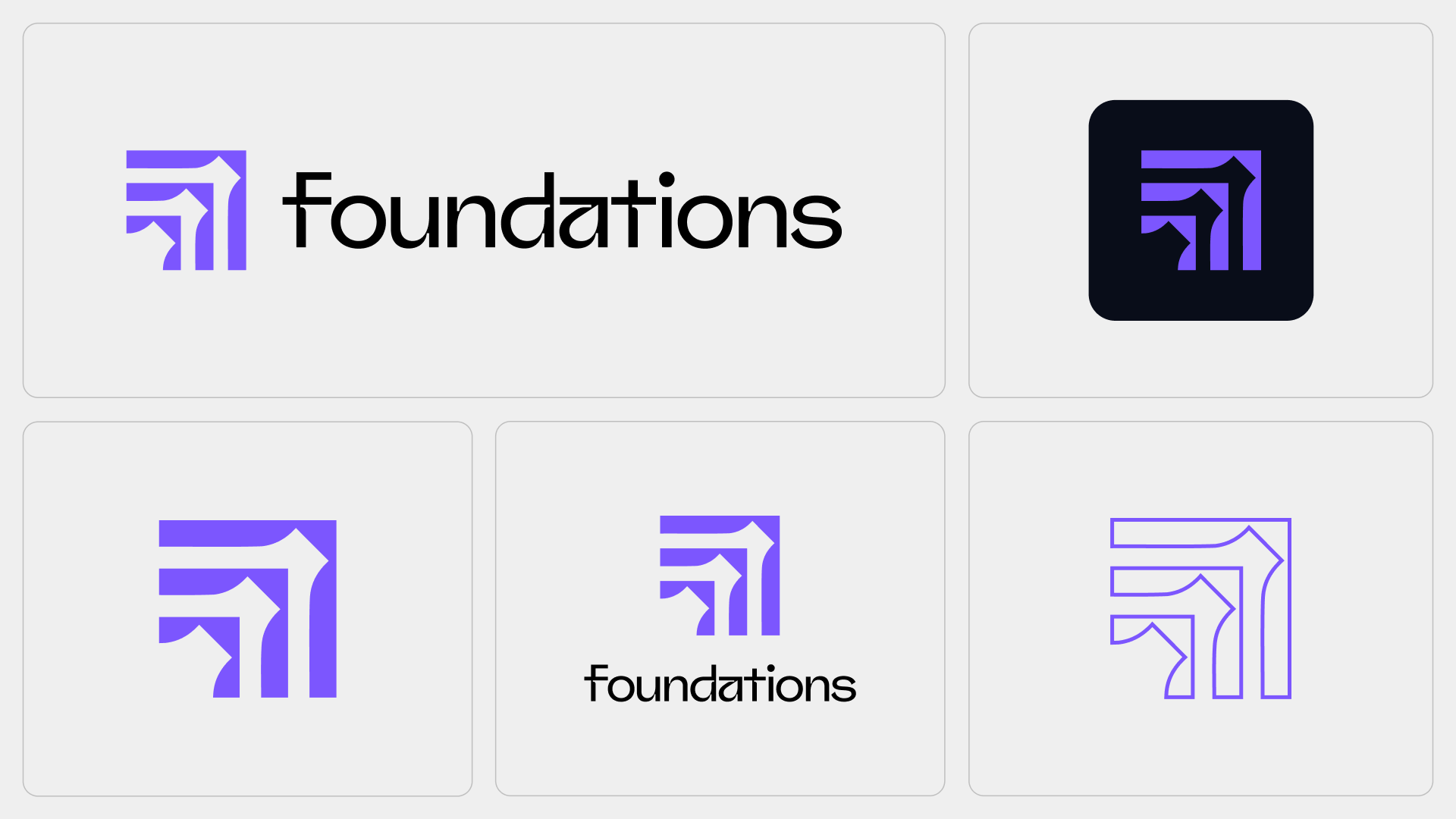
We started with language. Before any pixels moved, we sat down with the team to clarify who they are, who they are for, and what they want founders to feel every time they encounter the brand. From there, we refined the core idea into a clear promise, designed a modular logo family, and built a vivid colour palette supported by a practical style guide that shows how the system works in real-world contexts, not just on pretty layouts.
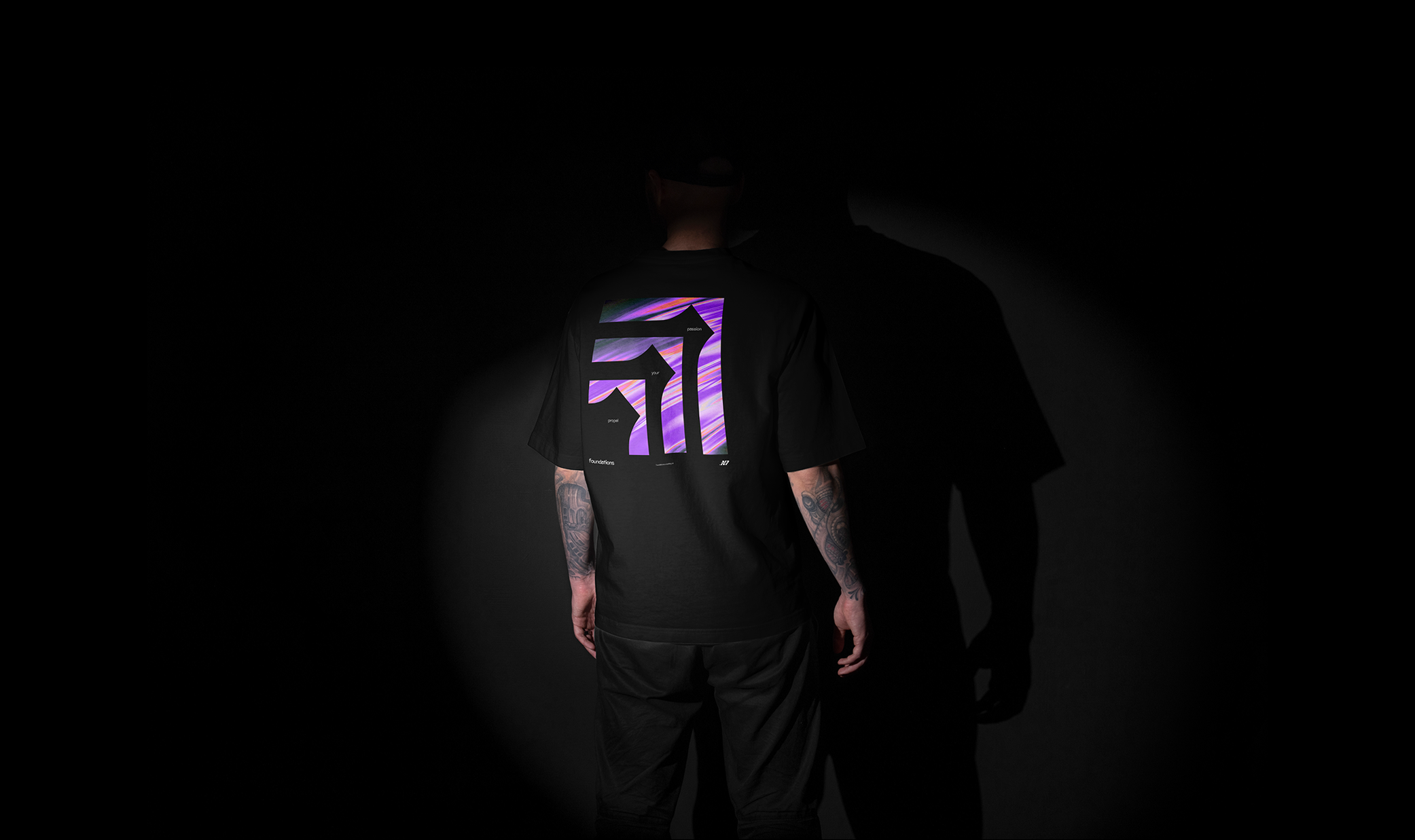
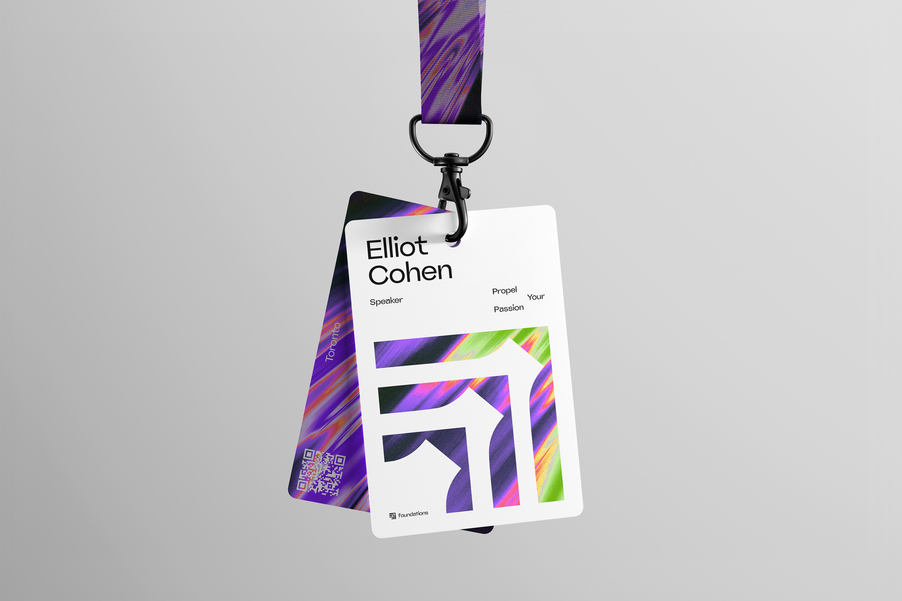
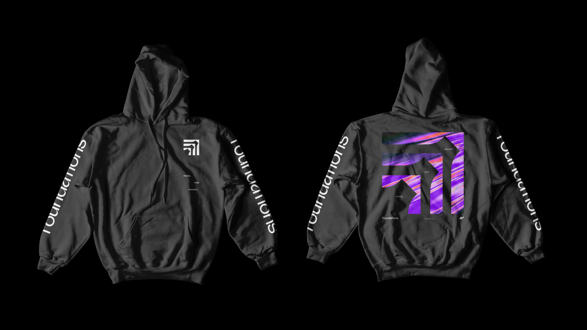
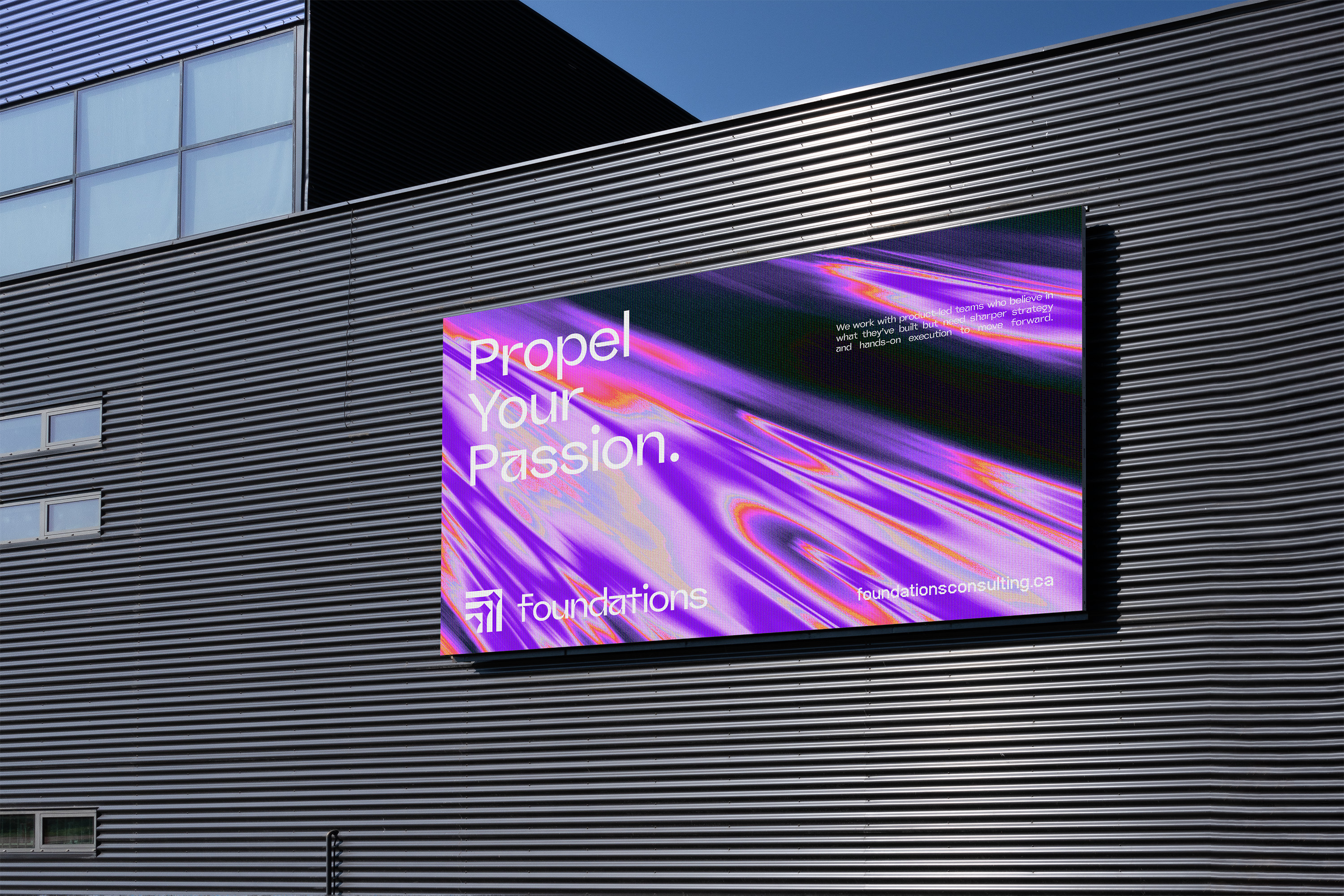
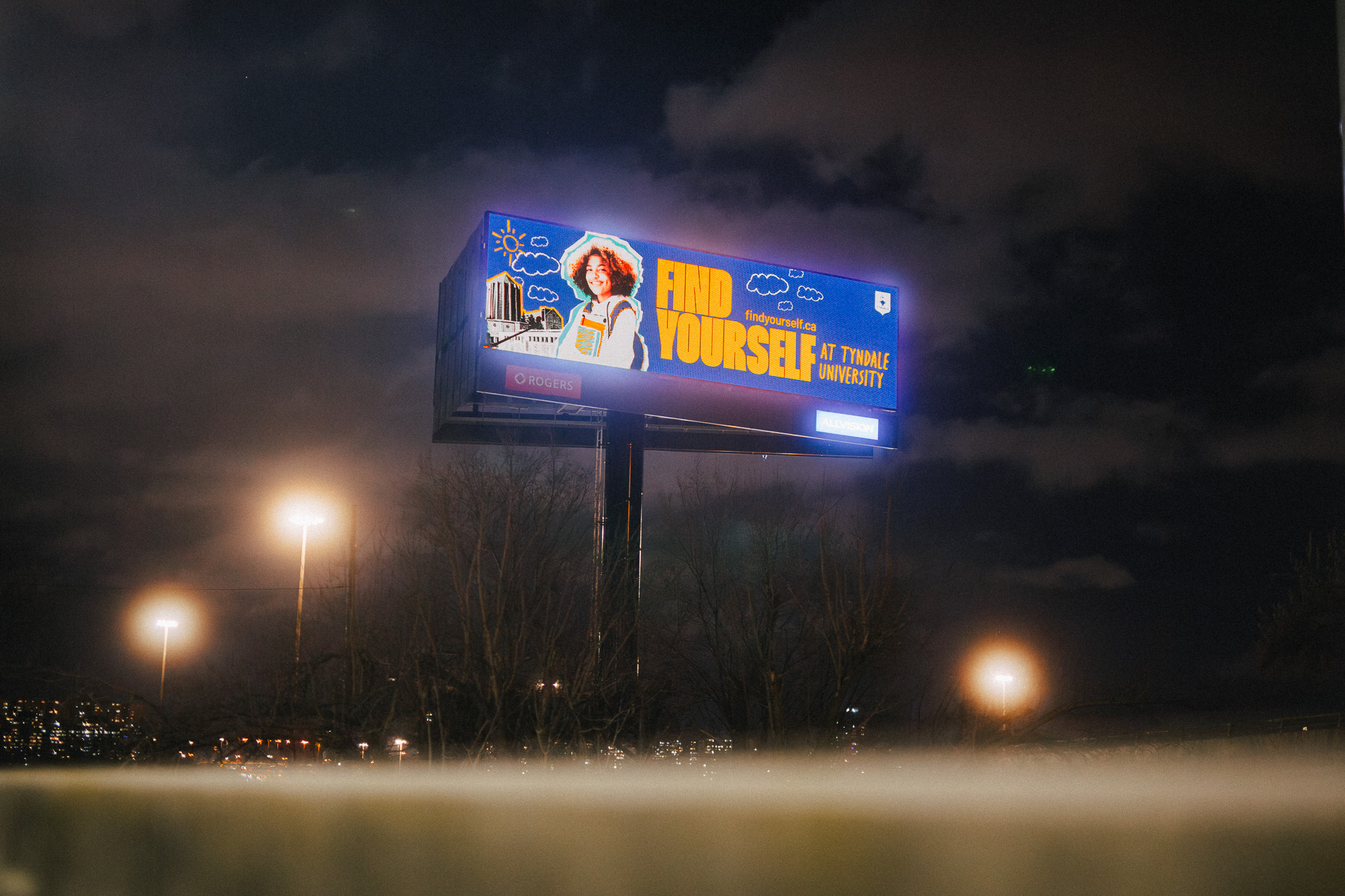
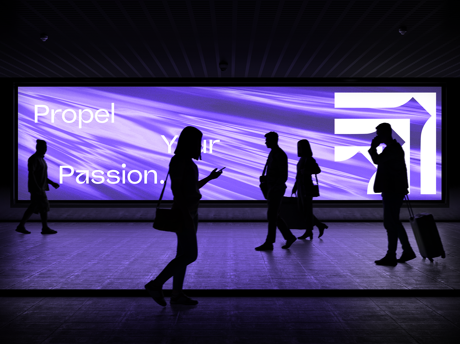
With the new identity in place, Foundations now has a recognizable visual language that stands out in a crowded consulting space, a flexible logo and type system that works from investor decks to social to product UI, and clear guidelines that make it easy to stay on-brand as they grow, hire, and launch new services.
Most importantly, the brand now matches the energy of the work. When founders encounter Foundations, the visuals, language, and experience all say the same thing: “These are my people.”
As three partners with different perspectives, we needed help developing a cohesive brand identity and aligning on a single vision. The MAKE team guided us through the process with confidence and clarity, helping us discover the common threads that truly represented Foundations. What impressed me most was MAKE's ability to facilitate alignment while making everyone feel heard. If you're looking for a partner who can deliver outstanding creative work while navigating complex stakeholder needs, I highly recommend MAKE.